That Studio Brand Identity Design - A Case Study
The hilariously named That Studio is a sound studio and recording space in Bombay. From the get go, the clients told us that the brand needed to be fun, but also serious.
Rather than tell them that wasn’t really possible, we scratched our heads for a bit and decided that maybe, just maybe, it was.
IDENTITY DESIGN
Hey, we’re nothing if not obedient to our clients’ needs. They wanted an identity that was fun+serious, we’d give them an identity that was fun+serious.
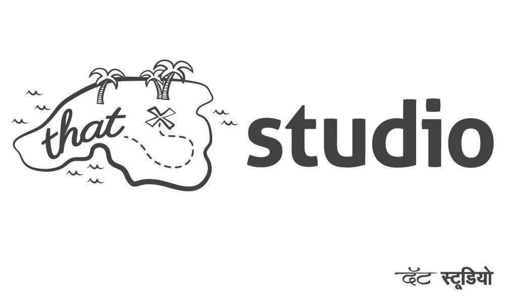
We literally broke the logo up into two parts — the fun one and the serious one. The “That” was a quirky, handwritten typeface, while the “Studio” was a very serious and business-like sans-serif typeface.
The first “That” half would be an always changing, adaptive element, integrating the word into a number of different, always meaningful, creations.
Then, depending on the medium and usage, we designed different Thats, and, may we add, had a blast doing it.
The base logo identity
The adaptive identity would be customised for each use case, and medium. So, for the two founders, we tailor-made the identity to fit their job descriptions.
The partner in charge of finances, got a cash machine, the one in charge of marketing and publicity got a blimp.
For the sign outside the studio, we created a map of an island
Direction sign on the corner, up the road
For the receipts and bills
For letterhead and envelope
In-studio signage and posters
Launch announcement graphic for social media
STATIONERY DESIGN
With this dual and adaptive identity sorted out, we created a set of stationery for That Studio which added another layer of customisation to each collateral.
We created a custom pattern for each partner, which complemented their custom logos perfectly.
We also integrated the custom identity into a whole bunch of their other collateral, including receipts, envelopes, in-studio signage and directional and outdoor signage.
All things considered, we more than achieved what we set out to do when the client first asked us to create something that was equal parts fun, and equal parts serious.


