A Case Study in Clarity — The SAGlass Brand Identity Design
The Brand
SAGLass is our long-time client, one of those rare clients that appreciates and respects the design process, allowing us to continually push the envelope with the work we do for them.
They’re one of India’s most reputed glass companies, and a big part of that enviable reputation is because of the honest way in which they do business. The clarity (pun not intended) in their products extends to their sense of purpose and focus on the bigger picture, long-term goals and a brighter future–not just for their business, but for the planet at large. They are, in every sense of the term, a truly forward thinking company.
Being our clients over the last so many years, we have grown to know and understand their brand well. While we’ve been brought on for smaller design projects for them over the years, our eye was always on the big prize — of completely redesigning their brand identity. We believed their existing identity wasn’t conveying their brand personality and purpose effectively. However, we also knew what a huge risk it was for an established and respected company to change its decades-old and easily identifiable brand identity. Nevertheless, we persisted, and a few months ago, finally began working on building the new SAGlass brand identity from scratch. In this blog post, we’ll walk you through our process, and the reasoning behind the decisions we made at each step of that process.
Through The Looking Glass
As is often the case, we began by looking at the products — SAGlass made everything from architectural glass, to car windshields, to glass for consumer goods. At the same time, as a company, SAGlass stood for clarity, honesty and long-term sustainability. The company wasn’t one to rest on its laurels (of which it had many), and instead was in a constant state of evolution. It has won awards for its efforts in sustainable manufacturing, renewable energy, and a myriad other green practices. They don’t just make those efforts for CSR brownie points either — they actually, genuinely, want to help the world, beyond the walls of their manufacturing plants.
Combining the physicality of their products with these core values of their brand, we knew that the final identity would need to evoke a sense of transparency, clarity and that state of constant evolution.
To kick things off, we decided to dive, head-first, into the glass making process. And things got pretty hot and heavy.
Setting Temperatures Soaring
Glass is essentially a mixture of sand, limestone and soda, among other raw materials. This mixture melts into a liquid molten state at about 1,500℃, at which point it is moulded/blown/cast into its final shape.
When we saw glowing, deep orange, molten glass for the first time, we were mesmerised. It was beautiful, and we knew we just had to use it somehow. We studied many versions of glass in this raw state for what felt like weeks, trying to understand the rules that governed these amorphous blobs. We watched footage of molten glass being dropped from different heights, just to understand how it flowed and how its physical form and colour changed as it cooled.
And then we put pen to tablet, mouse to Photoshop, and began to try replicating that process visually. Simultaneously, we tackled the logotype.
Glass in its molten, most malleable state
The Logotype
We knew that the identity would be dominated by the dynamic visualisation of molten glass. Even when we didn’t know exactly how we’d achieve the final form of that molten glass within the identity design, we knew we had to plan for it.
The logotype then had to be complementary, clear and bold, without any frills or affectations. A commanding sans-serif seemed obvious, and we eventually zeroed in on one that fit the bill — not just standing by itself, but also when we introduced it within the final visual identity we created (more on that next).
The final logotype
We settled on our own custom take on the Effra typeface. Using a mixture of bold and light weights to distinguish the acronym from “Glass”, we also softened the corners of the typeface to give it that fluidity the brand demanded.
The resulting logotype fit the brand ethos perfectly, and better yet, fit within the identity design system like a glove.
A Blob Begins To Take Shape
Molten glass is an interesting, fascinating thing (did we say that already?). We studied the shape of hot glass as it spread, and our exploration of that shape and its colours led us to a set of variations, some of which are shown below.
Our exploration of the “blob” element
The last row didn’t feel right at all — it was too jagged and not as organic as we’d have liked. The first two rows though, those we could work with. The process of elimination, and then tweaking, began.
The “blob” started coming along nicely, and we hit upon our next challenge — transparency. Sure, making a part of the colour gradient transparent and changing the background to showcase that transparency effectively was one way to do it. But it didn’t feel good enough. We kept digging.
It was a happy accident that brought us our Eureka moment. While finalising the “blobs”, at some point we tried moving one “blob” across another, and voilà, everything literally fell into place.
By using two blobs, each with a similar gradient of deep orange to a translucent light blue, one blob on top of the other, we were able to create that sense of dynamic transparency and fluidity we’d been striving for. After a bit of trial and error, the final blob elements for the identity began to reveal themselves.
Layering one blob over another was the answer we were looking for
We knew this identity had to be dynamic and amorphous, and this new blob element had to achieve that all by itself. But still, it couldn’t just be random.
We’d need to set some ground rules for our new blobby friend.
The Identity Design System
There were four main components of our new design system:
Content — the actual text, images, details that we’d have to factor in
Environment — the size of the collateral — print, web, wherever
Logotype — “SAGlass”
Element — the “blob”
The blob (or the “Element” as we always referred to it around the client) would be made up of two halves — both filled in with a similar gradient. We created a set of 8 variations of the half-and-half blob Element, to be used across different collateral, media and use-cases.
The final 8 variations of the blob “Element”
Next up, the logotype had to fit within this Element, and that needed some structure and rules as well. We decided the sweet spot would be to always give the logotype 40% of the Element’s space.
When the focus of a particular communication or collateral is the logo itself (a hoarding or signboard, for example), the Element could fill up most of the collateral space, with the logotype still taking up 40% of the Element.
The gradient we used was also carefully formulated. It was made up of three colours — a deep orange (CMYK:0,75,80,0), a lighter orange-almost-yellow (CMYK:0,37,100,0) to a very faint blue (CMYK:10,0,0,0).
The size of the element (as far as possible) would equal the width of the environment – the width of the content.
Finally, the placement of the Element would always (or, as far as possible) be at the corner of the environment, and flow into the space itself.
All those rules being set, we left enough room for our designers to explore their individual vision without sacrificing brand integrity through design. If we broke the rules every once in a while because it felt like the right thing to do in those special circumstances, well, so be it.
Execution & Collateral Design
We put all our rules into a brand guidelines document, to share with the client, but mostly so we could design the collateral without losing our minds.
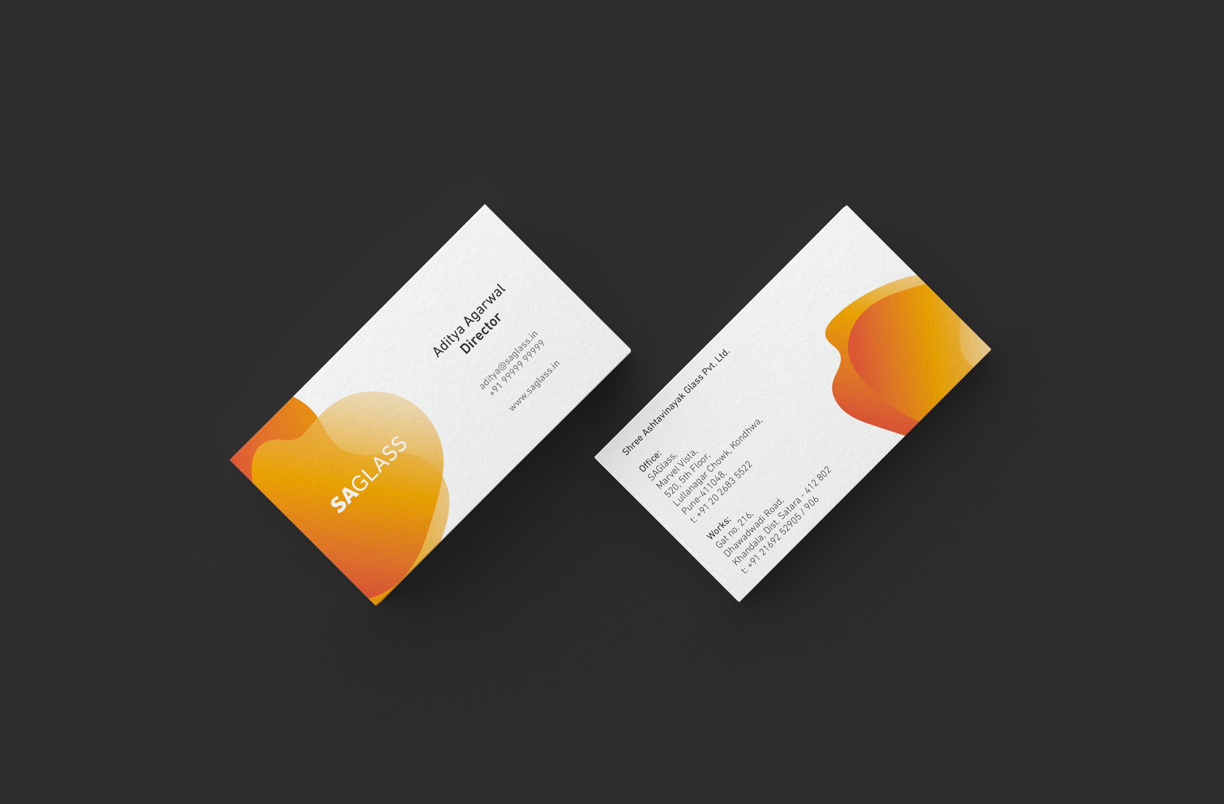
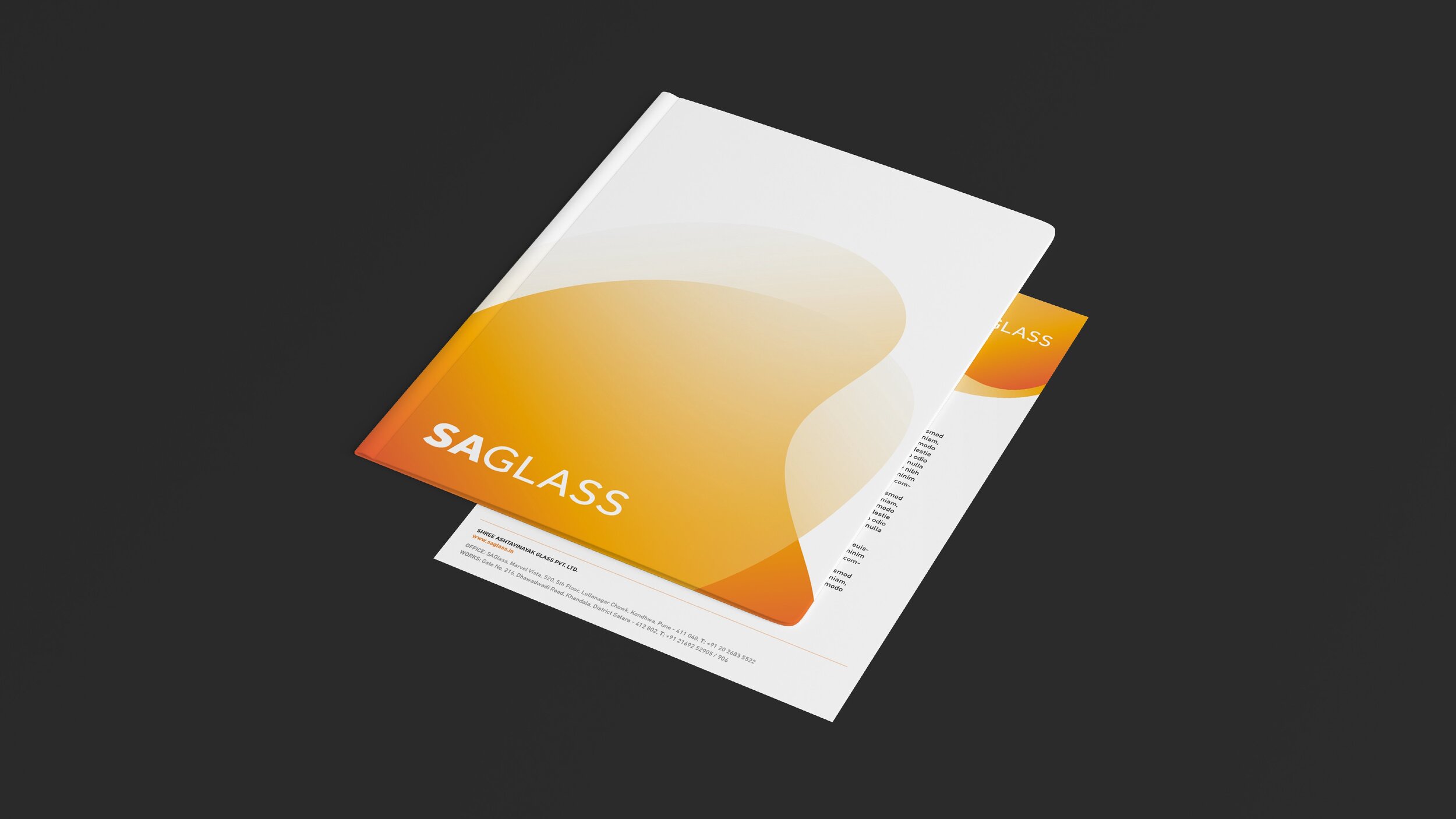
For a company as large as SAGlass, the final collateral we would need to design and build for them was obviously huge. For the purposes of this little blog post, go ahead and check out the stationery we designed, using all of our carefully formulated rules.


There you have it, in all its gorgeous, clear, orangey glory — the brand spanking new SAGlass brand identity. We absolutely loved working on this project from the get go, not just because of how beautiful and well thought-out the final product became, but because the client gave us complete creative freedom throughout our process, and let us take our time with our research.
Good clients are great motivators for fantastic work. We’re firm believers of that. If you’re working with a good client, we’d recommend giving them a hug or sending some love their way, right now. They are a rare breed indeed.


