It Ain’t Over Till It’s Over
Growing up, my only access to music was bootlegged VHS cassettes of chart shows, lyric books and posters from the local Archies’ store and music shops. Ah, those music shops — a cornucopia of treasures with records or LPs that my parent’s generation revered to cassettes and (much later) CDs that my peers and myself collected with an ardour now reserved for…I guess, Instagram likes?
But, let me not digress. This article is all about music and more importantly album covers. Defined as the “the front of the packaging of a commercially released audio recording product, or album,” album covers were so much more than just protective sleeves for records or cassettes. To their hordes of fans, album covers were the first glimpse or hint of what the musician or band had in store for them. As the musician Tony Bennett so rightly put it, “when you bought a record, you felt like you were taking home your very own work of art.”
The concept of album covers and cover art can be traced back to Columbia records, its first ever Art Director, Alex Steinweiss, and his use of cover art in the late 1930s. By the time the revolutionary 60s came around, iconic bands such as the Beatles and the Rolling Stones and their even more iconic album covers were soon pushing the boundaries of how a musician’s public image was portrayed. From double fold out covers to lyric sheets and sticker inserts, albums and their artwork soon became as anticipated as the music within them. Delve a little deeper into the progression of album cover art and you will inevitably come across the pathbreaking design team Hipgnosis who were responsible for a number of Pink Floyd albums, Black Sabbath’s Technical Ecstasy and Peter Gabriel’s self titled solo album to name just a few of the nearly 200 other radical cover sleeves in their entire body of work. The company soon became pre-eminent among the most forward-thinking album cover designers in the world.
With the advent of the Internet and downloadable and streaming music, the very purpose and concept of album art is clearly changing. Some might say, that the future of cover art is uncertain but I would like to err on the optimistic side. While the role of packaging is completely different today, music files and albums still posses embedded digital album artwork. According to reports, physical music products with “digital art or covers” still continue to outsell plain digital downloads. Album art is still considered a vital part of the listening experience to many, and despite the less-tangible nature of digital images, there are still many collectors trading cover art and music. So, there is hope yet!
The talents of many photographers and illustrators from both inside and outside of the music industry have been used to produce a vast array of memorable LP/CD covers and I could spend paragraphs listing them out along with their most memorable music packages, but where would be the fun in that. Instead, I put out a public service request and asked some audiophile friends two simple questions:
What is your favourite album cover design?
Why does it top your list?
Read on to see what I discovered.
Vikram Bhalla
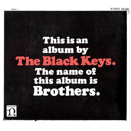
The Black Keys — Brothers
The design of this cover is so simple, it’s brilliant. It seems like one of those ideas that comes out at the end of days and weeks of brainstorming fails. When nothing else seems to work, and you throw your hands up in the air and blurt out the simplest, most obvious solution, and it turns out to be a stroke of pure genius.
Another thing about this artwork that holds a special place in my heart, is their choice of typeface — Cooper Black — which is one of my all-time favourites. Finally, the album itself has some of the greatest tracks by the Black Keys (in my opinion of course, before the trolls come charging at me with pitchforks and torches), so everything really came together for me, when this one came out.
Arjun Rajkishore
Run The Jewels — 1, 2 and 3
Ever since I discovered the rap duo, the most fascinating thing for me is that they can use the same elements across the board for all their communication, and still have a vivid meaning behind each iteration. Nick Gazin designed the logo, and then Timothy Saccenti designed the art for RTJ3. Timothy Saccenti (a frequent collaborator for art with RTJ) says, “For us, the RTJ1 hands were about ‘taking what’s yours’ — your world, your life, your attitude. The RTJ2 hands were wrapped in bandages, signifying injury and healing, which for us represented the growth in ideas and tone of that album. For RTJ3 the bandages are off, the chain is gone and the hands have been transformed into gold. For us this represents the idea that there is nothing to take that exists outside of yourself. You are the jewel.”
Soma Mitra Chubb
Pink Floyd — Dark Side of the Moon
The way we feel about a cover is inextricably mixed up with the way we feel about the music. I only have to see the cover to be transported back to my darkened bedroom listening to the haunting music and such lyrical gems as “quiet desperation is the English way.”
I think it’s also the simplicity of the stark black background in contrast to the rainbow spectrum coming out of the other side of the prism, leaving the listener free to interpret the image any way they like. (Am I the prism? Is the white light the music, being refracted through my consciousness into a beautiful spectrum?)
Amrita Ganguly
Paul McCartney — Off the Ground
It’s clever and unpretentious. And off the ground, with the feet off the ground, gives a light and happy feeling.
And the blue. The happy blue.
Shivani Shah
James Bay — Chaos and the Calm
The album cover tells a story, and tells it well.
It’s a simple photograph — James Bay, wearing a leather jacket, jeans, and fedora, getting ready to step out of a dark stairwell into the outdoors. It’s his studio debut, and he’s ready to step into the light (literally and metaphorically).
There are no bells and whistles in the photo, no over-processing or fancy design elements or fonts. It’s a lot like the album itself — raw, mellow, real. It’s great visual storytelling and perfectly encapsulates what you’ll get from listening to the album.
Sunil Kirpalani
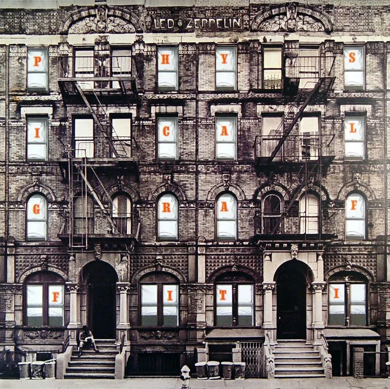
Led Zeppelin — Physical Graffiti
I just thought it was the most innovative album cover I’ve seen. The fact that you can move the inner sleeve depicting a New York City tenement, through whose windows you could glimpse into individual lives and their stories to me was mind blowing.
I used to spend hours poring over the album cover while listening to the music, and for me the two soon became synonymous. And therein lay the magic.
Kurush Canteenwala
Supertramp — Famous Last Words
I like the cover for Famous Last Words as its graphic meaning is immediate and the metaphorical implications are overt.
Then there’s also its contextual background — it is the last Supertramp album in the original line up, the title is tongue in cheek, and the cover seems to suggest an awareness of this as well. Over all I like the design, and the use of space on the sleeve (the perspective).
There’s one thing that becomes immediately evident from even this small range of responses — that music is an emotional reaction. Album art may be revered for its intricacies and interpretations, but at the end of the day, it’s the magical combination of how the music makes you feel and what the album cover made you think that is the deciding factor on whether it stays on your list of must-haves, or gets filed away, never to be heard from again.


