

'The Story Goes On' Brand Identity — A Case Study

The Story Goes On showcases a plethora of products across a wide variety of categories — including technology
The Client
We often find art galleries intimidating and/or pretentious. But from day one on this project, we knew ‘The Story Goes On’ was going to radically change people’s preconceived notions about art, design and antique collection. It definitely worked its magic on us, and we’ve been hooked ever since.
The idea behind the brand was twofold — on the one hand it was a brand that aimed to break the age-old mould that art and antique galleries have made for themselves, especially in India, over the past few decades; the other aspect of the brand was to be a showcase, and marketplace, for gorgeous antiques from all over the world, whether those were 60 year-old televisions or 100 year-old rocking chairs. There’s something in this collection for everyone, and we don’t just mean collectors.
The collection at The Story Goes On (TSGO) features a staggering number of items and artefacts from across multiple categories. Browsing through their catalogue, you’re bound to fall in love over and over and over again. One of the first lessons we learned was that the items on offer weren’t valuable just because they were old. Their real value lay in their stories, the stories of the people who created them, and the generations afterward that owned, used them and passed them on. The “damage” is often times celebrated. Every blemish, every crack, every missing screw told a story about that object and where it came from.
And if you were lucky enough to buy one of the pieces on offer, the story goes on, with you.
The Brief
The biggest challenge for us, from a branding and design point of view, was to make the brand relatable to a younger audience. An audience which most likely hadn’t ever been exposed to the arts or antiques. The brand needed to be approachable and friendly, but more importantly, it needed to change public perception of the art and antique industry. If that sounds like a Herculean task, believe us when we say it definitely was. And we were definitely nervous.
Never ones to shy away from a challenge though, we began by putting a plan in place. To begin with, we would need to split up the TSGO project into three equal, and very important, parts — the identity, the collateral/stationery, and the communication.
The Design
Communication
The communication would prove to be the most daunting task of all, because one half of the brand was meant to be essentially a platform to educate us regular, non-art-background, non-pretentious folk about art and antiques, in a way that was fun and inclusive, not elitist and grandiose. To achieve this, we knew we’d need all the help we could get. Enter our crack team of exceptional content writers — Jigna Padhiar, Nafisa Crishna, Melanie Andrade and Neha Mathrani — who helped shape our content and communication plan from scratch. From long form articles about art, design and antiques, to product descriptions and product stories, this team had it all under control. Entrusting the communication in their very capable hands, the rest of our team then focussed on the brand design. That brand design is what we’ll be discussing in this post.
The Brand
At first, our exploration of existing brands in the arts and antique space threw up a lot of antique-y, vintage-y work. Lots of gothic fonts and family crests and complicated illustrative logos…
We worked out a couple of design directions that, while being interesting, fit the same mould we saw everywhere else, and would honestly have been lost in the current market.
We presented the client with the two directions which, in hindsight, we weren’t really sold on ourselves. The client, fortunately as it turned out, rejected both directions outright, and we had to go back to the drawing board with just a few days left on the clock.
We scrapped everything we’d done so far, and began to re-evaluate the brand. What we were trying to achieve here, we decided, was to make antiques relevant and exciting to people with short attention spans who have become accustomed to slick bezel-less screens, retina displays and pixel perfect apps. We realised we were trying to modernise an “antique” aesthetic, when what we really needed was to approach this identity simply as a modern, 21st century brand that sells beautiful, one-of-a-kind objects with incredible stories behind them.
We stopped looking at the products as “antiques”, and that tiny shift in our approach changed everything.
Almost instantaneously, the new identity began to take shape. We threw out the old colours and stuffy references, and we introduced a bright new palette and a clean, modern aesthetic. One that would feel at once familiar to our audience, and yet fresh and exciting.
The Identity
Our minds now racing, we looked at the name again, and split it right down the middle.

“The Story” was the reason why these objects had so much value attached to them. It was because of where and when they were created, because of the people who owned them and used them and often wore them down, and because of the generations these objects had outlived. Their stories were what made them not just valuable, but priceless.
The experience of buying one of these products didn’t just end with the sale. They had survived hundreds of years, and most likely, would survive well past their current owners. The story of the object would “go on”, and it was up to the current owner to make sure they had something of value to add to that story. It was a responsibility, and one that couldn’t be taken lightly.
Our brand then, would have to convey both these points to be effective. It needed to tell these stories, and it needed to make sure those stories would leave room for continuity.
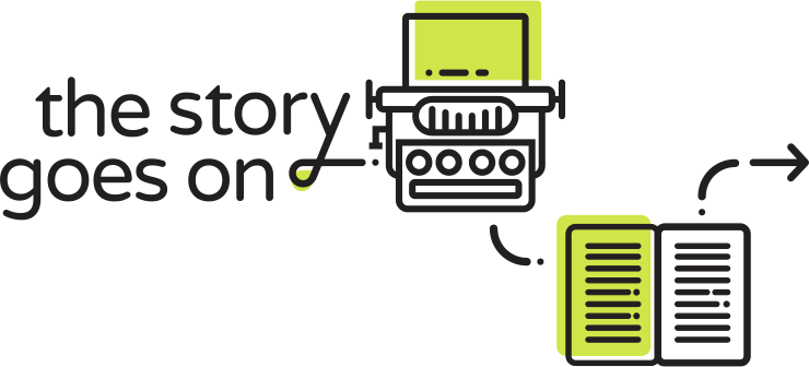
We visualised this by creating a dynamic logomark.
Playful, fresh and friendly, this identity was so far from anything else in the antique and arts space in India, that we couldn’t help but pat ourselves on the back once it was complete.
The ‘y’ in “story”, and its arrow extension, signified the continuation of these stories, and in use, this logomark would move apart to include what we called “Icon Stories” (more on those next).
The client loved it instantly (of course), and we were off to the races.
The “Icon Stories”
The idea of the Icon Stories was quite a eureka moment for us. We decided that in every possible use-case we’d need to tell a different story, with the logomark and the right-facing arrow being the only consistent design elements. This was no easy task, and for it to work we would require a huge bank of icons, all created in a singular style but still individually distinctive. So we began by doing just that — creating the style for the icons that would make up our little “Icon Stories”.

A few of the icons we designed to make up our “Icon Stories”
The resulting icons would need to cover not just the products themselves, but also the broader categories, materials, time periods, connectors & behaviours, and even depict the extensions of the products — a typewriter could be paired with an icon for paper, for example.

The brand arrow from the logomark continues through the icon stories and brand extensions
This would need to be an ongoing exercise, of course, and we’d need to create new icons every time a new product, category or feature was released. Lots more work, sure, but oh what fun!
The Colours
The colour palette we chose would have similar motivations — further accentuating that fresh, modern vibe of the brand by complementing the identity everywhere possible.
With a dark grey on white being the primary colours for the logomark, we created a secondary palette as complementary accent colours. Always supporting and never overwhelming the brand or the products themselves.

The brand colour palette
In the logomark and icon system, the colours would play the role of versatile accents that borrow from the products and add to the playful tone of the brand. In practice, the colours did their job perfectly.
The Typography
As with every other aspect of the TSGO brand, the typography too had to be playful, confident, and friendly. There was also the matter of us having a typeface which was conducive to long-form article writing and all the demands of such a medium. We chose Nunito as our brand typeface. With its many weights, Nunito was perfect for long-form copy.

The Nunito font family was the perfect companion to the brand
Print Collateral & Stationery
Once the identity was defined, we extended it across the brand collateral. The “Icon Stories” became a fun, dynamic way to make every piece of branded material interesting. The visiting cards had post boxes, pencils and letters on them, the packaging had an indicator of what was inside, the social media posts visually translated the stories of the products they were talking about — in every instance of the brand, a story was being told. And with every story, there came that sense of continuity.

The stationery came alive with our Icon Stories
The “ Icon Stories” were so effortlessly deployed across the entire set of print collateral, that they act as talking points all by themselves. They inspire curiosity in anyone who comes across them, and they become an easy way for the brand to begin telling its stories.
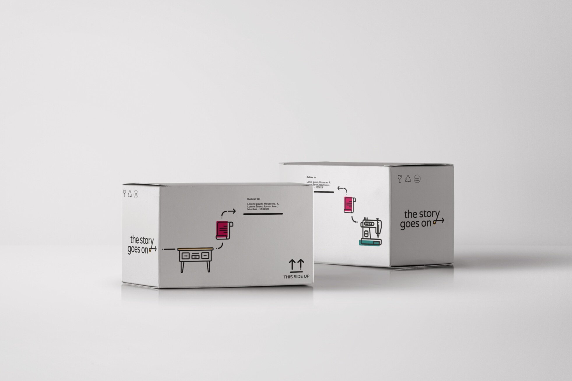
The packaging was fun, colourful, and engaging
End Results
The brand identity was a huge hit with everyone involved. We’re very proud of the work we did on the branding, and we were so damn excited about seeing it all out there in the real world. But alas, as luck would have it, the business itself suffered a setback near the very end of the project, and the launch of the brand and platform has had to be put on hold for the time being.
We’re sure ‘The Story Goes On’ will launch soon enough, and the grand vision we all had for it will be realised. But until then, we just had to share our work on the brand with the rest of you, and give you a glimpse into our process and the reasons behind the choices we make as designers every day. We hope you’ve enjoyed reading about our work as much as we enjoy the work itself.
Until the next one then, thanks for stopping by!